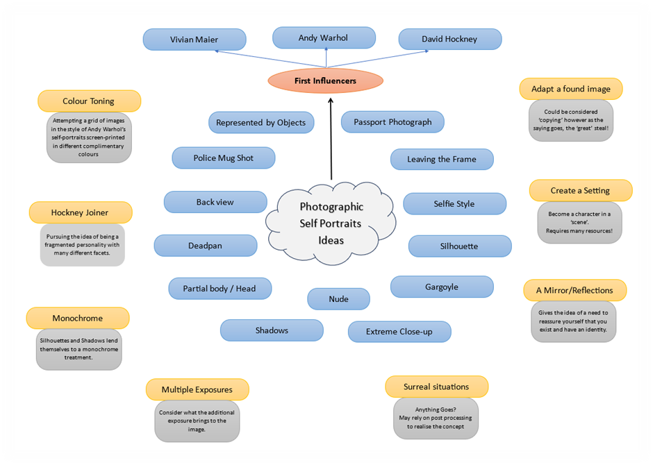
My initial idea for this assignment was to look to photographers and artists that I am already familiar with, Maier, Hockney and Warhol, as their self-portraits offer quite different visual and technical possibilities and frankly, they offer an opportunity to mask a straight forward portrait style with a technique that can look flashy. Additionally, the images in 500 Self-Portraits [2018] informed some more ideas, as did the self-portraits by the photographers we were guided to examine in the course documentation. (see Project 1 Research).
Although I’ve put this ‘mind map’ towards the top of this post, it has been developing as I remember previous experiences with self-portraits, and as I’ve done more research. In any event it frames my thinking and what I might try out.
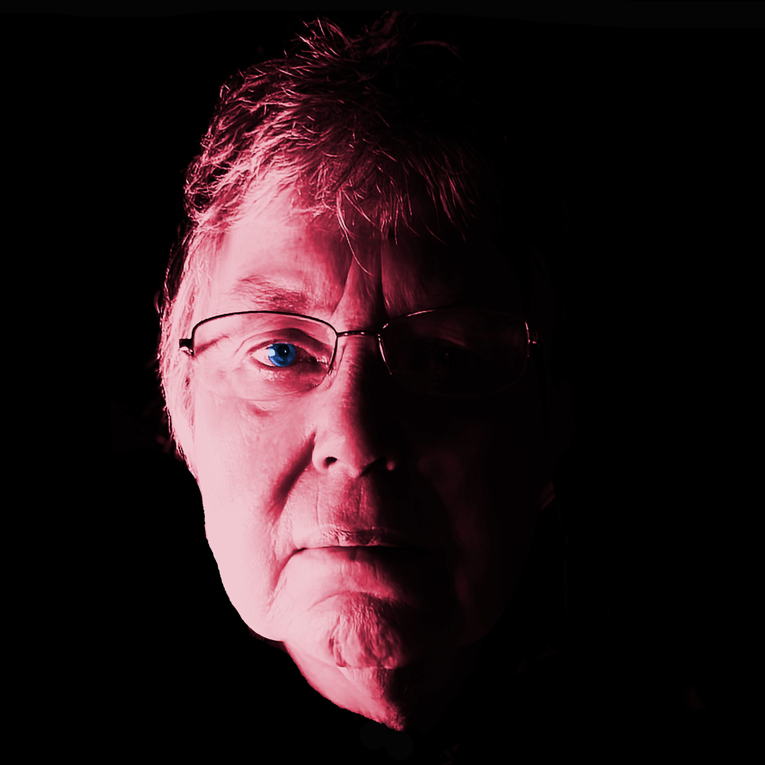
Although I have really dismissed the colourful Warhol style self-portrait as a cliched idea, I do need to get to grips with Affinity Photo as I have abandoned my Adobe subscription! I will be using a variety of post-processing techniques throughout the course so the images you see below were an experiment to see if I could achieve my ideas in Affinity that were vaguely influenced by Warhol. I have used an image that I took Maier style as a reflection in a mirror. I processed it as high contrast minimalist mono, but then I worked it up to change the black into the vaguely complementary colours you see. (Method: Black and white image in grey scale, change to sRGB, add a pixel layer, paint over with colour, change blend mode).

After my initial ideas I thought about an idea I’d had in the past which was to let words convey the concept by combining phrases and lines from a poem such as “Warning” by Jenny Joseph which plays to my rebellious side. However, I already know that I cannot use the words of that poem because I previously asked for a different purpose. Although in club competitions we are always told not to include text I do not think in this assignment context it would detract from the image. It is only a consideration if I can find appropriate text so that idea is on hold.
Attempting to make the self-portrait more interesting there are two approaches I could adopt: an innovative technique, for example Alma Hasa’s 3D origami overlays on the faces of her portraits, or, an emphasis on the elements of a portrait that David Bate [2019] outlines, face, pose, clothing, location, props. These elements provide meaning for the viewer, as can be seen in Cindy Sherman’s work.
So… what am I thinking now?
I would be more comfortable with my non-appearance in the ‘self-portrait’. Location and props are probably not enough to qualify as a ‘self-portrait’. In fact Rafman’s desks are indicative of a life style rather than a self-portrait (not his I think) just as Cindy Sherman’s work is not a self-portrait in the given sense of the word, but representing a life lived by others. I’ve dismissed the still life idea because it would almost certainly be a dishonest representation, as I would attempt to control the ‘interpretation’ by selecting the props and a location, not one closely revealing or associated with me. Of course I am still going to control as far as possible what the observer sees in my self-portrait.
Now I’m back to thinking of including myself in the image. Many of the ideas in the centre of the mind map are non-starters. Nude, it’s just not going to happen! Police mug shot and passport photograph are non-starters as I’m not a criminal, although my current passport photo makes me look like a criminal. I quite resent that, as it is contrary to how I’d like my identity to be represented in such a public document.
When I saw the resentment and scorn on Donald Trump’s police mug shot I was reminded of the photograph by Lartigue of himself as a boy in the bath that a self-portrait did not always require that the one in the image had to be the one pressing the shutter. Although I will be the photographer for my self-portrait.
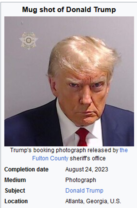
Donald Trump was in control of all of the features of his mug shot – save when the shutter opened to take the image. This is a carefully crafted self-portrait. An approach maybe that I should have adopted for my passport photo taken in a photo-booth. While the location may not have been one Trump would have chosen he knew he would have his photograph taken there! The rest he could control, face, pose, and clothes give the observer the view that Trump took a dim view of the proceedings.
The techniques used by Alma Hasa such as the torn and fragmented images, are interesting and at a level of surrealism I can incorporate as inspiration without too much variation from a reality that I can make sense of. However, it would be a bit like creating a Hockney Joiner – it would be a copied idea. I particularly like Hasa’s pop-up approach in her book showing the Cosmic Surgery origami images, although I find her Cosmic Surgery images very unsettling, I’d like to try something like that as I have done a lot of paper folding for boxes, books and origami. Unfortunately time to effectively think through how I might incorporate folded images that are not direct copies of things I’ve seen limits my inclination to spend the time (possibly fruitlessly) to experiment and follow through the ideas.
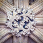
I have to get on with this so while thinking of something spectacular (not very successfully) I have been playing and have completed two self-portraits which are offered below. The Early English stone masons of the middle ages are my influences for my grotesque image. The variegated coloured self-portrait has been influenced by Warhol.
I’ve a project running photographing ‘stone heads’, mostly of grotesques in churches. Adopting a surreal approach to the self-portrait, I’ve tried here to turn myself into a grotesque, I have taken selfies where I could be mistaken for one! It would be a way of poking fun at myself as the comment about my passport suggests I take myself too seriously. The ‘real’ stone head below was photographed at Bridlington Priory last month. The image of myself is a selfie with my mobile phone as I sit at my computer.

(Method: Starting with the selfie, I selected the face, changed it to black and white, used Nik collection silver effects film-noir to add the grittiness for the stone effect. I merged my image with the stone head image on a separate layer. Some colour adjustments with a yellow filter and a little blur added finished the image.)

In the end I have returned to an initial idea of colour toning in Affinity Photo, which will result in a more conventional self-portrait. Although I would have preferred to have blue or teal in the image (a favourite colour) It was suggested that being the colours of the Ukrainian flag made it an inadvertent political statement. Not what I’d intended! However it is a warning that observers bring their own interpretations to images.
In the event I prefer the final image below. The blue is replaced by green, with a background that is a combination of the analogous colours red and yellow. The yellow in the background suggest a person with hope and cheerfulness, while red suggests a person of energy and passion. The green supposedly suggests peace and calm, although I think here it is a sickly colour, that combined with the wry look on my face suggests – take the colour meanings with a pinch of salt!
This is the self-portrait I will probably go with.

This image is posted on the padlet for Self-Portraits: https://oca.padlet.org/ginalundy/1-1-self-portrait-y50awk3mi1jx1pem/wish/3016901485
