I’ve been trying to connect the practical activities to the history of photography. I feel that it was a misdirection in the title of the assignment!
references
The internet is a fantastic information source! Rabbit holes are a constant problem, but lead to interesting ideas. Some of my references and those I’d like to consult are behind paywalls and therefore inaccessible to the general reader!
things I found out while considering the histogram
The histogram on the camera gives information about the preview jpeg image, not the raw image. This means that processing the raw image may mean that detail can be recovered in the ‘clipped’ areas (maybe!) as there is a difference in the data available in a jpeg at 6MB and a 16MB raw image for example.
There is a good reason for the adage expose to the right, (ETTR) which I had always discounted. Although your image may look overexposed (something I had noted and the reason for discounting this saying) is because on the histogram, which is counting pixels at different data points, the white end of the histogram has many times more information than the black data points. This means that there is more data to play with in post-processing your raw image, and the reason why your image looks overexposed. However in an article in Photography Life [Sept 10th 2022] this was observed “For many photographers, the image quality gains simply are not worth the hassle of exposing to the right.” An additional suggestion is that bracketing is a good idea just in case you expose too far to the right.
thoughts about the Frame exercise
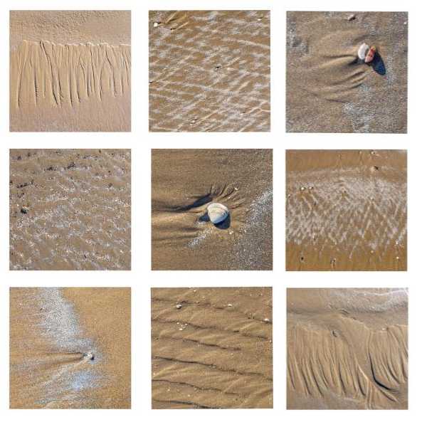
I remembered that I have attended several talks that could inform this exercise as I was unsure how to approach it (I know I was given instructions on the course materials), mostly technical details on how to select and put together a grid. However I have always enjoyed collating images within grids to form a collage of images. Details that are ‘meaningless’ without a context can be arranged in such a way with other images equally as ‘meaningless’ on their own, to create and image that is more meaningful than its individual parts.
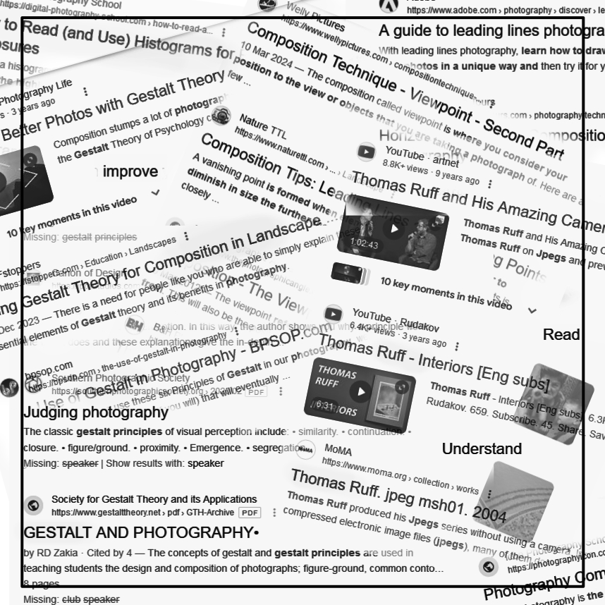
The ‘gestalt’ hint in the course materials sent me off on a tour around many internet pages, and thinking about how our minds tend to perceive and make sense of the images we see and the objects in them as part of a greater whole. Gestalt theory is a psychological way of thinking about composition – but it is still ‘rules’ sort of! For the frame exercise I will try to put into practice some Gestalt ideas, which with the Ruff research item I think is what is intended, keeping in mind that the ‘whole is greater than its parts!’.
I remembered a photographer whose photo montage work I admired — Matthew Chase-Daniel. His work reminded me at the time of Hockney joiners but now I realise that he may have been using gestalt principles in the composition of some of his works.
I get the feeling I’m over thinking it, as I saw on one learning log that a student had basically made a Hockney joiner…? Which is not how I interpreted the requirements initially, but maybe that is a connection and an influence in completing this exercise.!
thinking about the research task and Thomas Ruff
The pixilated digital image is more of a trend than I would have thought so perhaps it is something to think about rather than being dismissive of something I’d thought was mismanagement of a digital image! …And after a day of playing around with my own pixilated digital image I find that Adobe have a YouTube video on ‘how to’ use the tools in Photoshop to do this more easily.
On doing an internet search to see if pixilated photographs were a thing, I found Nicholas Goodden’s Pixelated People project where he turns the people in his street photographs into the pixilated look alikes of video game characters from the 1980’s. He was influenced by Kelly Goeller and her Pixel Pour which is street sculpture rather than photography. Also, French photographer Richard Bachellier uses pixilation in his photographs to give a blurred painterly effect.
I’m also thinking its not such a new idea to look at the smallest element in an image. Warhol & Lichtenstein brought into the open the dots that make up either the half-tone method or the use of Ben-Dots. Initially at the end of the nineteenth century dots were developed to print photographs in newsprint and later screen printing. Hockney’s larger ‘joiners’ made of hundreds of photographs are effectively ‘pixilated’. They demonstrate the idea that the ‘whole is greater than the parts’.
These Pop Artists were more creative with the idea than Ruff! I don’t think Ruff has been creative!
further thinking about grain and pixels
Moving on to assignment 3 and pursuing one of the references in the course materials to the film Blow Up (Michelangelo Antonioni, 1966), I observed the way that by ‘blowing up’ or zooming into an analogue print you could possibly find more detail but if you try that with a digital image you will get less detail as it pixilates. (?)
